 Semantic UI
ctrl+k
Enter a search term above to see results...
Semantic UI Enter a search term above to see results...
Your component’s HTML structure is defined by a template and a data context to generate your component’s HTML.
Comparing to React Instead of using a
render()function to returnjsx, each component’s template provides the high-level logic for explaining how HTML should be rendered from data for your component and will automatically re-render sections of a template depending on the reactivity of the data.
Your template defines how your component’s HTML is rendered:
if else if and elseFor more information see templates.
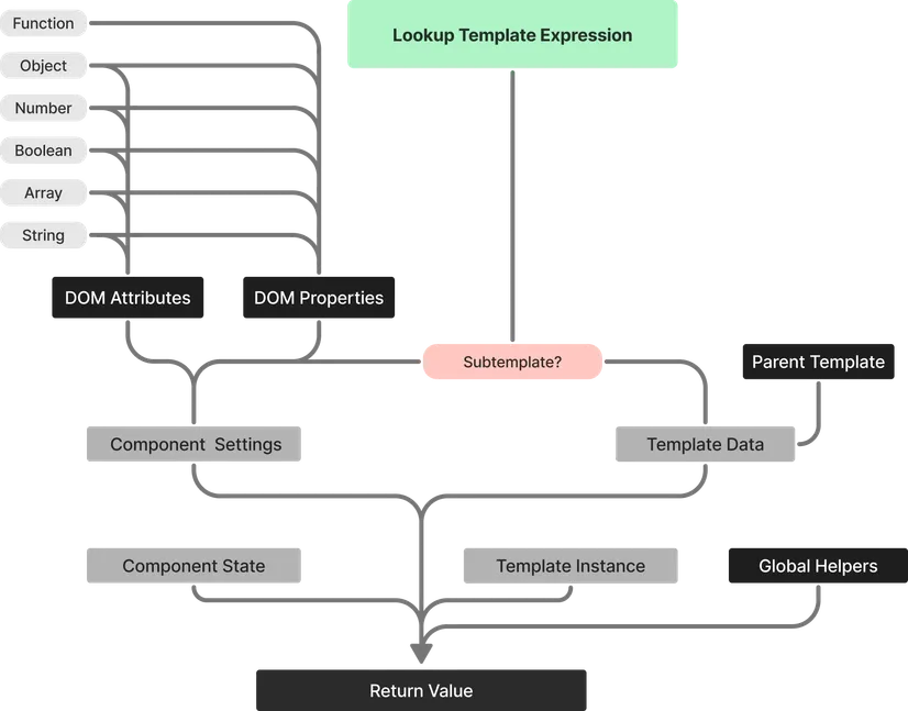
The template’s data context is a combination of several data sources that are looked up in sequence.
For instance, our template might include something like:
Greetings, {name}This will check for name in each of these locations and then return the first available defined value:
namename passed in via HTML attribute or propertynamenamenameSimplified Data Structures - The data context is flat, making it easy to move values between
property,state, andsettingswithout modifying templates.
For comprehensive details on settings, see the dedicated Settings documentation.
Settings are values which you want users of your component to be able to modify. They provide a way to customize component behavior without modifying the component’s internal code.
const defaultSettings = { name: 'Jack', color: 'blue'};
defineComponent({ tagName: 'name-card', defaultSettings});You can override settings through HTML attributes or DOM properties:
<name-card name="Sally" color="red"></name-card>const el = document.querySelector('name-card');el.name = 'Sam';For comprehensive details on state management, see the dedicated State documentation.
State is a data store that uses Signals to recompute references to a value when its underlying value is modified. State represents the internal, changing data of your component.
const defaultState = { counter: 0, isActive: false};
defineComponent({ tagName: 'interactive-component', defaultState});State can be accessed and modified inside component methods and automatically updates your UI:
const createComponent = ({self, state}) => ({ incrementCounter() { state.counter.value += 1; }});In templates, state values can be accessed directly by name:
Counter value: {counter}Your component instance stores methods and properties that implement the functionality of your component. These can be accessed from various locations:
Any method or property declared in createComponent can be accessed directly from your template:
const createComponent = ({self, state}) => ({ getAge(user) { return Math.floor((new Date() - new Date(user.born_date)) / 31557600000); }});{getAge user}You can access your template instance as self, component, or tpl from other callbacks:
const onRendered = ({ self }) => { self.incrementCounter();};You can also access your component instance directly from the DOM:
const { component } = document.querySelector('ui-counter');component.incrementCounter();For comprehensive details on subtemplates, see the dedicated Subtemplates documentation.
SUI components can either be rendered to a tagname as a web component or exported to be used as subtemplates in other components. This is dependent on whether tagName is specified.
When no tag name is specified, they are returned as Subtemplates which can be passed in to other components.
When components are rendered as subtemplates, their data context is defined explicitly from the parent template.
Global helpers are utilities available in all templates and provide classMap, formatDate, concat, stringify to format values for output.
For a list of global helpers please visit the dedicated global helper page in templating.
In this example, formatDate is used to format the display of a date set in the component’s state.
{formatDate currentTime 'h:mm:ss a'}For a complete picture of how an expression is looked up from inside your template’s data context, please refer to the following chart: